Why your website's typography matters
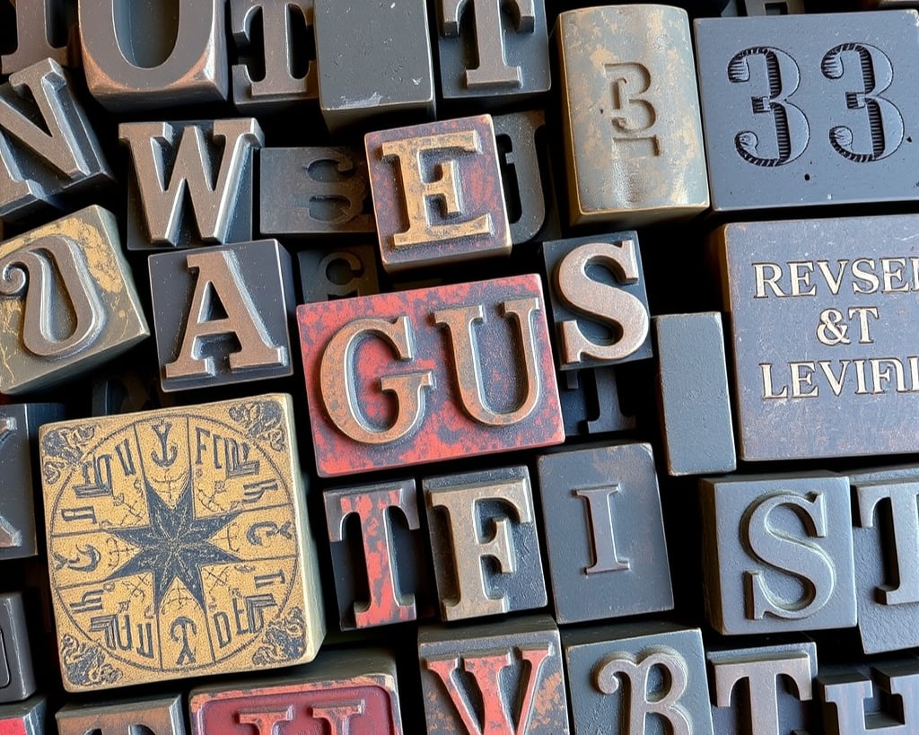
Let me spill some nerdy tea about fonts, because they are secretly running the show on your website, your brand, and yes, even your Instagram captions.
The Power of Typography and Font Psychology
Here's the thing - fonts are like your brand's accent. They're not just letters on a screen, they're telling your story before anyone reads a single word.
Just like I've learned to embrace my own neuro-spicy brain, your branding and website design need to embrace their perfect font personality too. Because typography isn't a "pick something that looks nice" decision. It's a brand design decision, and it shows up everywhere your business does: your homepage, your Canva templates, your Instagram carousels, the lot.
Get it right, and your whole online presence feels like you. Get it wrong, and even the best branding in the world reads a bit... off. A bit beige. And we don't do beige round here.
Web-Safe Fonts: The Tea
OK, real talk. You know how sometimes my brain wants to go in 17 different directions at once? Well, fonts can do the exact same thing across different computers and devices, if you let them.
Here's why web-safe fonts matter for your website design:
🪩 They're like the reliable friend who always shows up (pre-installed on most devices)
🪩 They stop your carefully crafted website from going rogue depending on who's viewing it
🪩 They keep your brand looking consistent, because nobody needs that kind of chaos
Pro Tip: Think your font game needs a glow-up? Check out "What The Font." It's basically Shazam for typography. Spot a font you love on someone else's site or on a social post? This tool will identify it and suggest similar options. Yes, I am that kind of nerd. No, I'm not sorry about it.
The Font Hit List: My Top 10 Recommendations
AKA fonts that won't let you down, whether you're building a website, designing a brand, or putting together your next social media template.
Bebas Neue (The bold bestie)
Helvetica (The classic queen)
Poppins (The friendly favourite - but dangerously becoming the Comic Sans of 2020's)
Montserrat (The versatile vibe)
Playfair Display (The elegant icon)
Garamond (The timeless treasure)
Josefin Sans (The modern muse)
Libre Baskerville (The sophisticated star)
Roboto (The reliable rock star)
Lexend Deca (The readable rebel)
Any of these are a safe, strategic starting point for your website or social media graphics because they're built to actually work, not just look pretty for five seconds before a browser renders them wrong.
Behind the Scenes at Jade the NerdBird
Want to know my secret sauce? Here's what I actually rock across my own branding and web design:
🎸 Lato - versatile, easy to read, does the heavy lifting for body copy
🎸 Hand Organic - handwritten vibes, used for headings only, because a little personality goes a long way
🎸 Cal Sans - the bold heading font that stands out a mile, exactly where I need it to
Three fonts. That's it. Because good brand design isn't about having options, it's about having decisions. The fewer fonts you're juggling, the more consistent (and recognisable) your brand becomes across your website, your socials, and everything in between. Font psychology at it's best!
Why This Actually Matters for Your Business
Here's the bit people miss. Your font choices aren't just a "web design" thing or a "branding" thing, they're a trust thing.
When your typography is consistent across your website, your Canva templates, and your social media posts, people recognise you faster. They don't have to work to figure out if that carousel is actually yours. It just looks like you before they've even read a word.
That's the whole point of good branding. Not decoration. Recognition.
Pro Tip: When in doubt, remember - your font choices should be as authentic as you are. They don't need to be perfect. They just need to be perfectly you.
TL;DR
🪩 Fonts are part of your brand strategy, not just a design afterthought
🪩 Web-safe fonts keep your website design consistent across every device
🪩 Fewer, well-chosen fonts build stronger brand recognition than lots of options
🪩 The same font system should carry across your website, branding, and social media
🪩 My go-to stack: Lato for body copy, Hand Organic for handwritten headings, Cal Sans for bold statement headings
Want your fonts, your website, and your socials all speaking the same language? That's exactly what we sort inside the NerdBird Brand Launchpad and NerdBird Web Launchpad.
Comment "BRAND" or "WEB" and let's get you sounding like you everywhere.
J 🤓🦅